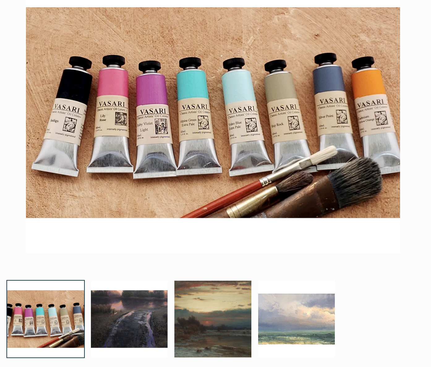
Handpicked colors
for an open palette
We all have a standard palette of colors we reach for.
For many painters, that is some variation of a warm and cool of each primary with some earth colors thrown in.
I personally use a limited palette - only a few colors - most of the time.
Sometimes, however, I want my standard mixes - mixes that I know pretty well - to be different somehow.
I want to use different words to speak. I want a different melody for the song.
Perhaps I choose only one of these colors to add to my palette for a painting. Perhaps I use one as a substitute for a regular color. The point is to do something different, to avoid saying the same thing as always.
In selecting these paints, I was also thinking of my favorite time of day - dusk. A look at this selection should seem familiar to those who like to linger when the color is leaving the sky.
The two neutrals - Ship Rock and Silverpoint - are warm and cool neutrals (respectively), but these have personality.
They are useful in mixtures to tame, but are able to stand on their own in a painting.
These 8 paints were chosen to be used in mixture - to break us free from our normal choices.
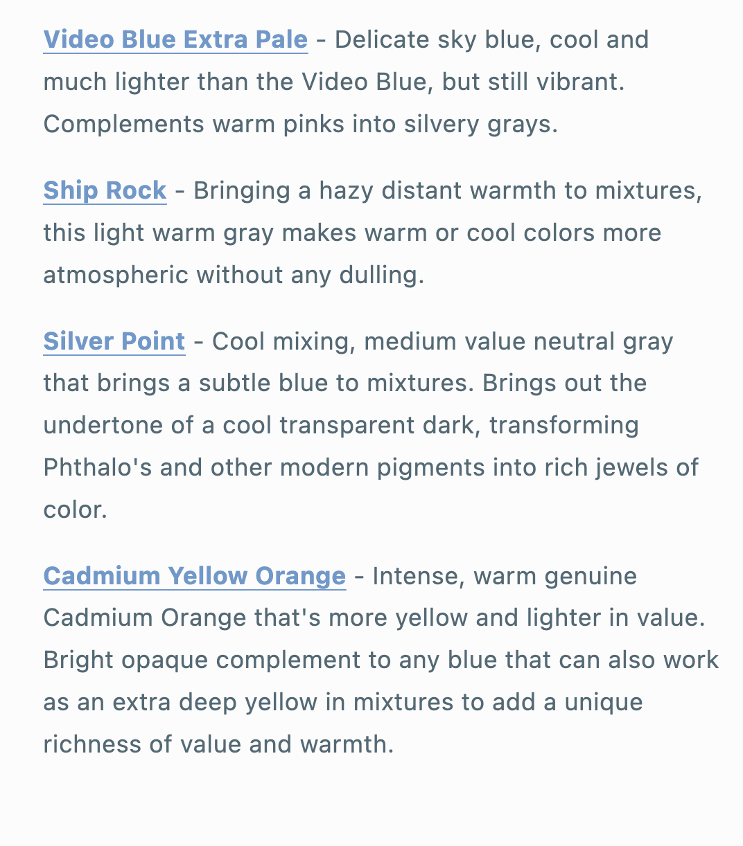
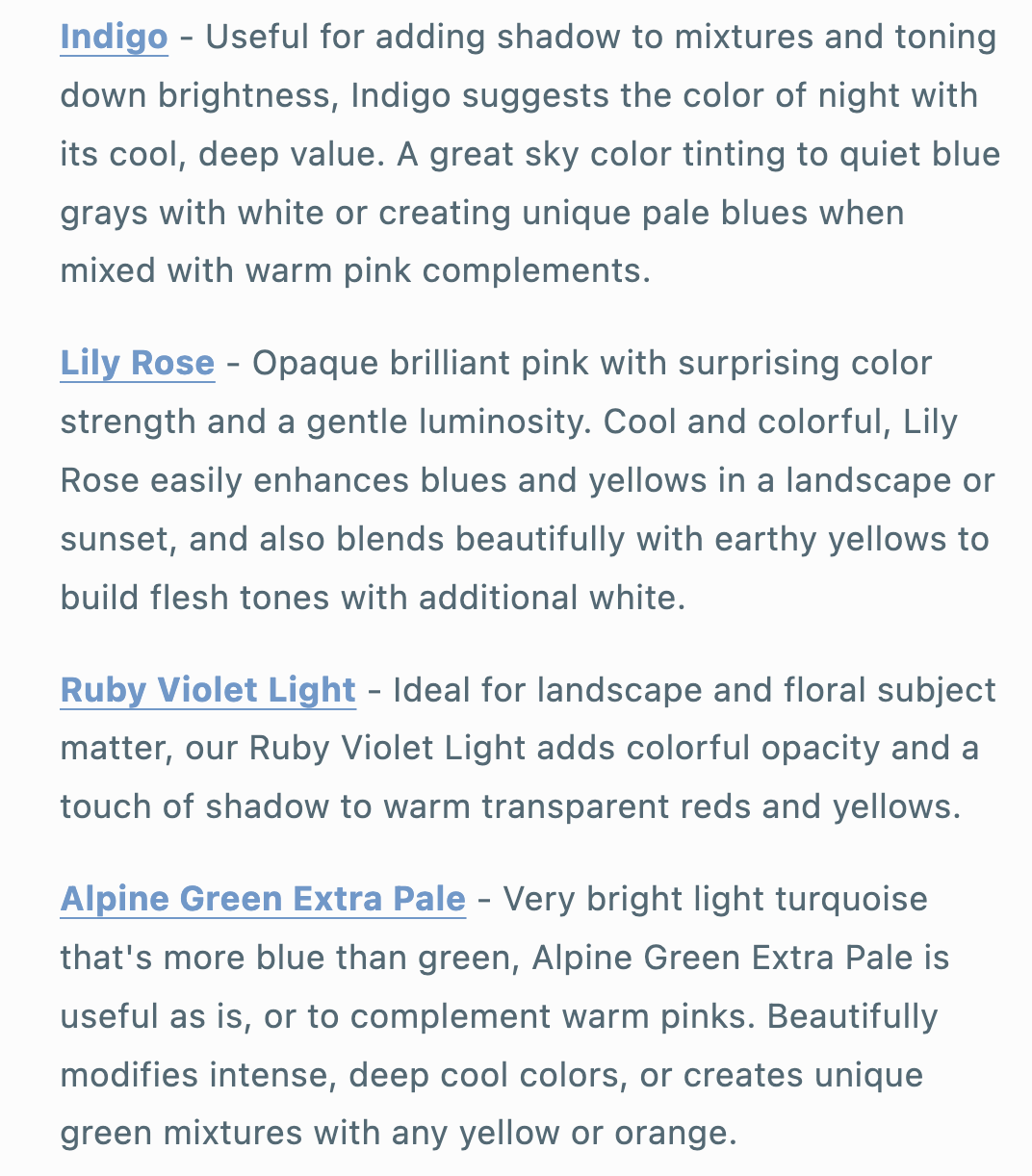
Try Lily Rose to push something back into the distance.
Try Video Blue Extra Pale as a white replacement.
See what your voice sounds like when you add Indigo instead of Ultramarine.
Add Alpine Green Extra Pale to your skies.
These are just a few ideas. These colors will help you re-imagine your mixtures and may open new ranges for your visions.
At least they have for me.